
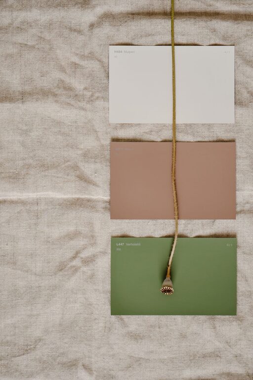
Creating a calm and inviting atmosphere in your home often starts with the colors you choose for your walls, furniture, and décor. Colors have a powerful impact on mood and energy, influencing how relaxed or energized you feel. If you want your living space to feel peaceful and soothing, selecting calm colors is essential.
In this post, we’ll explore tips to help you choose calm colors that suit your style and home environment. Whether you’re painting a single room or redecorating your entire home, these guidelines will make the process easier and more enjoyable.
Why Choose Calm Colors?
Calm colors are generally soft, muted, and gentle on the eyes. They help reduce stress, improve focus, and create a sense of comfort. These colors can make a room feel more spacious and airy, enhancing relaxation.
Some common calm colors include soft blues, greens, warm grays, and light neutrals like beige and cream. These shades often mimic nature, such as the sky, water, or earth, which naturally promote tranquility.
Tips for Choosing Calm Colors for Your Home
1. Consider the Mood You Want to Create
Every room in your home has a different purpose, so think about how you want to feel in each space. For example:
– Bedroom: Aim for colors that promote restfulness, like pale blue or lavender.
– Living Room: Choose warm neutrals or muted greens to encourage relaxation but also social interaction.
– Home Office: Soft greens or light grays can help maintain focus without feeling too sterile.
2. Look for Muted Tones
Bright and bold colors can be energizing but might disrupt calmness. Instead, select muted or pastel versions of your favorite colors.
For example:
– Instead of bright yellow, try a soft buttery shade.
– Swap out vibrant red for a dusty rose.
– Choose powder blue rather than a bold sapphire.
Muted tones create a sophisticated and soothing atmosphere.
3. Use a Neutral Base
Neutral colors like greige (a blend of gray and beige), soft white, or pale taupe are excellent foundations. They balance other accent colors and allow flexibility in your décor choices.
Neutrals also reflect natural light well, making rooms appear brighter and more open.
4. Draw Inspiration from Nature
Nature provides endless calm color palettes. Think of the colors found in a forest, beach, or sky:
– Sage green, soft moss, or olive tones evoke calmness found in plants.
– Sand beige and seashell pink bring a peaceful coastal vibe.
– Light blues and gentle grays reflect water and clouds.
Using natural-inspired colors helps create a restful environment that feels connected to the outdoors.
5. Test Colors in Different Lighting
Lighting dramatically affects how colors appear. Always test paint samples on your walls before committing.
– Observe how the color looks in natural daylight, evening light, and under artificial bulbs.
– Keep in mind that north-facing rooms may have cooler light, while south-facing rooms get warmer light.
Trying samples at different times of day prevents surprises and ensures the color truly feels calm in your space.
6. Combine Colors Thoughtfully
Layering colors adds depth without overwhelming the senses. Use the 60-30-10 rule for balance:
– 60% neutral or base color
– 30% secondary color in a calm tone
– 10% accent color for subtle contrast
For example, paint walls a soft beige (60%), add furniture in muted green (30%), and decorate with pale blue pillows (10%).
7. Don’t Forget Texture and Materials
Calm colors work well with natural textures such as linen, cotton, wood, and ceramic. Incorporating these materials enhances the peaceful feeling and adds warmth to the room.
For instance:
– Linen curtains in soft gray
– Wooden furniture with a weathered finish
– Ceramic vases in gentle earth tones
These textural choices complement calm color palettes perfectly.
8. Use Color Psychology as a Guide
While personal preference matters most, understanding basic color psychology can help you pick calming hues:
– Blue: Often linked to calmness, trust, and serenity.
– Green: Associated with nature, balance, and renewal.
– Lavender/Purple: Invokes relaxation and creativity.
– Beige/Gray: Creates neutral, peaceful backgrounds.
– Soft pink: Brings warmth and a nurturing feeling.
9. Avoid Overly Dark or Saturated Colors
Dark or intensely saturated colors can sometimes create a heavy or overwhelming environment if not balanced properly. Instead of painting entire rooms in deep hues, consider using them as accents through pillows, rugs, or artwork.
10. Trust Your Instincts
Ultimately, the most important tip is to pick colors that make you feel calm and comfortable. Spend time with your samples, visualize how the space will look, and choose what resonates with you.
Conclusion
Choosing calm colors for your home is an enjoyable way to create a peaceful retreat from the outside world. By considering the mood of each room, testing colors in different lighting, and drawing inspiration from nature, you can design a harmonious environment that supports relaxation and well-being.
Remember to keep your palette muted and balanced, incorporate natural textures, and most importantly, trust your personal preferences. With these tips, you’ll be well on your way to a calm and inviting home.
—
Feel free to share your favorite calm colors or tips in the comments below!